
Statistics [17]: Python [01] - Data Representation
Published:
Data representation and manipulation in Python.
Data As Table
In Python, the data can be seen as a 2D table, or matrix, with columns giving the different attributes of the data, and rows the observations. The following example is taken from data.scv, where there are 7 attributes and 5 observations.
"";"Gender";"FSIQ";"VIQ";"PIQ";"Weight";"Height";"MRI_Count"
"1";"Female";133;132;124;"118";"64.5";816932
"2";"Male";140;150;124;".";"72.5";1001121
"3";"Male";139;123;150;"143";"73.3";1038437
"4";"Male";133;129;128;"172";"68.8";965353
"5";"Female";137;132;134;"147";"65.0";951545
...
Importing Data
To import data into the workspace, we can use pandas.read_csv (or other formats, which can be referenced to pandas) from pandas module, the imported data would be a pandas.DataFrame.
import pandas
data1 = pandas.read_csv('data.csv', sep=';', na_values=".")
The results look like below.
   Unnamed: 0  Gender  FSIQ  VIQ  PIQ  Weight  Height  MRI_Count
0           1  Female   133  132  124   118.0    64.5     816932
1           2    Male   140  150  124     NaN    72.5    1001121
2           3    Male   139  123  150   143.0    73.3    1038437
3           4    Male   133  129  128   172.0    68.8     965353
4           5  Female   137  132  134   147.0    65.0     951545
...
Alternately, we can also create data from arrays using pandas.DataFrame, which can be seen as a dictionary of 1D series.
t = np.linspace(-6, 6, 20)
sin_t = np.sin(t)
cos_t = np.cos(t)
data2 = pandas.DataFrame({'t': t, 'sin': sin_t, 'cos': cos_t})
The results look like below.
           t       sin       cos
0  -6.000000  0.279415  0.960170
1  -5.368421  0.792419  0.609977
2  -4.736842  0.999701  0.024451
3  -4.105263  0.821291 -0.570509
4  -3.473684  0.326021 -0.945363
...
Manipulating Data
pandas provides a lot of methods for manipulating the data, [here] is a list of the methods supported. We can call DataFrame.describe() to have a glimpse of the data imported.
Here is the result.
       Unnamed: 0        FSIQ         VIQ  ...      Weight     Height     MRI_Count
count   40.000000   40.000000   40.000000  ...   38.000000  39.000000  4.000000e+01
mean    20.500000  113.450000  112.350000  ...  151.052632  68.525641  9.087550e+05
std     11.690452   24.082071   23.616107  ...   23.478509   3.994649  7.228205e+04
min      1.000000   77.000000   71.000000  ...  106.000000  62.000000  7.906190e+05
25%     10.750000   89.750000   90.000000  ...  135.250000  66.000000  8.559185e+05
50%     20.500000  116.500000  113.000000  ...  146.500000  68.000000  9.053990e+05
75%     30.250000  135.500000  129.750000  ...  172.000000  70.500000  9.500780e+05
max     40.000000  144.000000  150.000000  ...  192.000000  77.000000  1.079549e+06

[8 rows x 7 columns]
One of the useful method is the DataFrame.groupby() method, which can be used to split a dataframe on values of categorical variables. Below is an example.
groupby_gender = data1.groupby('Gender')
for gender, value in groupby_gender['VIQ']:
    print((gender, value.mean()))
Here is the result.
('Female', 109.45)
('Male', 115.25)
When we call groupby_gender.mean(), the results would be the following.
        Unnamed: 0   FSIQ     VIQ     PIQ      Weight     Height  MRI_Count
Gender
Female       19.65  111.9  109.45  110.45  137.200000  65.765000   862654.6
Male         21.35  115.0  115.25  111.60  166.444444  71.431579   954855.4
Plotting Data
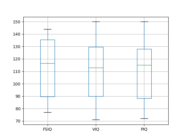
pandas.DataFrame has a couple of methods that can be used to plot simple figures. For example, the boxplot() method can be used to draw a plot figure.
data1.boxplot(column=['FSIQ', 'VIQ', 'PIQ'])
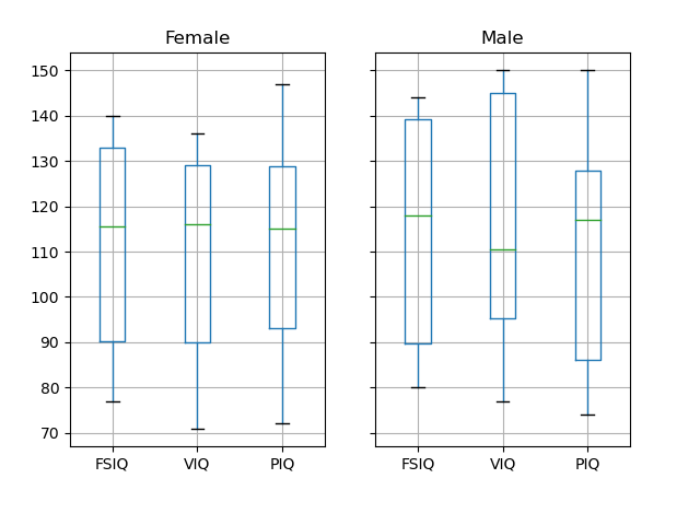
Apply this method to groupby_gender.
groupby_gender.boxplot(column=['FSIQ', 'VIQ', 'PIQ'])
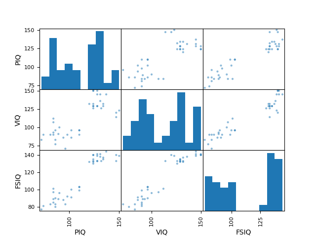
More complex figures can be plotted using plotting from pandas, which uses matplotlib behind the scene.
from pandas import plotting
plotting.scatter_matrix(data[['PIQ', 'VIQ', 'FSIQ']])
Alternately, we can also use seaborn for data visualization, which is based on matplotlib. However, it provides a high-level interface for drawing attractive and informative statistical graphics.
Table of Contents
- Probability vs Statistics
- Shakespear’s New Poem
- Some Common Discrete Distributions
- Some Common Continuous Distributions
- Statistical Quantities
- Order Statistics
- Multivariate Normal Distributions
- Conditional Distributions and Expectation
- Problem Set [01] - Probabilities
- Parameter Point Estimation
- Evaluation of Point Estimation
- Parameter Interval Estimation
- Problem Set [02] - Parameter Estimation
- Parameter Hypothesis Test
- t Test
- Chi-Squared Test
- Analysis of Variance
- Summary of Statistical Tests
- Python [01] - Data Representation
- Python [02] - t Test & F Test
- Python [03] - Chi-Squared Test
- Experimental Design
- Monte Carlo
- Variance Reducing Techniques
- From Uniform to General Distributions
- Problem Set [03] - Monte Carlo
- Unitary Regression Model
- Multiple Regression Model
- Factor and Principle Component Analysis
- Clustering Analysis
- Summary
Comments