
Data Visualization [01]: Matplotlib Basics
Published:
Basics of matplotlib.
import numpy as np
import matplotlib.pyplot as plt
import pandas as pd
Figure and Subplots
Creation
Plots in matplotlib reside within a Figure object, which is created with plt.figure():
fig = plt.figure()

fig
Out[13]: <Figure size 640x480 with 0 Axes>  # default size 640x480
In IPython, an empty plot will appear. we can then add subplots using add_subplot():
subfig1 = fig.add_subplot(2, 2, 1)
subfig2 = fig.add_subplot(2, 2, 2)
subfig3 = fig.add_subplot(2, 2, 3)
subfig4 = fig.add_subplot(2, 2, 4)
Alternately, we can use plt.subplots() to create subplots, which creates an array of subfigures:
fig, axes = plt.subplots(2, 2)
axes
Out[26]:
array([[<AxesSubplot:>, <AxesSubplot:>],
       [<AxesSubplot:>, <AxesSubplot:>]], dtype=object)
Simple Plotting
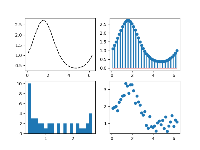
To plot a figure/subfigures, we use fig.plot_name() or plt.plot_name():
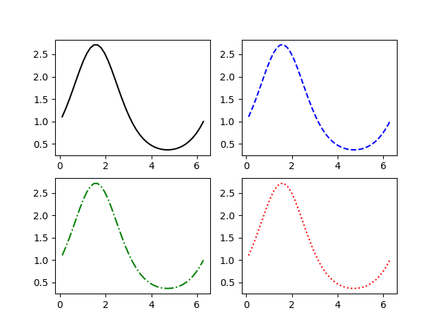
fig, axes = plt.subplots(2, 2)
x = np.linspace(0.1, 2 * np.pi, 41)
y = np.exp(np.sin(x))
axes[0,0].plot(x, y, 'k--')
axes[0,1].stem(x, y)
axes[1,0].hist(y, bins=20)
axes[1,1].scatter(x, y + 3*np.random.random(41))
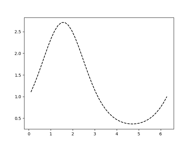
Plotting Labelled Data
obj = pd.DataFrame(np.array([x,y]).T,columns=['xlabel','ylabel'])
plt.plot('xlabel', 'ylabel', 'k--', data=obj)
All indexable objects are supported. This could e.g. be a dict, a pandas.DataFrame or a structured numpy array.
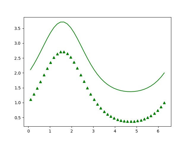
Plotting Multiple Sets of Data
x1 = x
y1 = y
x2 = x
y2 = y + 1
plot(x1, y1, 'g^', x2, y2, 'g-')
Plotting Styles
Plot styles can be controlled via various parameters. Here is a complete list of the Line2D parameters. Below are some commonly used ones:
alpha: Set the alpha value used for blending- `color’ or ‘c’
drawstyleordslabel: Set a label that will be displayed in the legendlinestyleorlslinewidthorlwmarkermarkersizeorms- …
color
b: blueg: greenr: redc: cyanm: magentay: yellowk: blackw: white
Besides these, any color on the spectrum can be used by specifying its hex code (e.g., ‘#CECECE’).
drawstyle
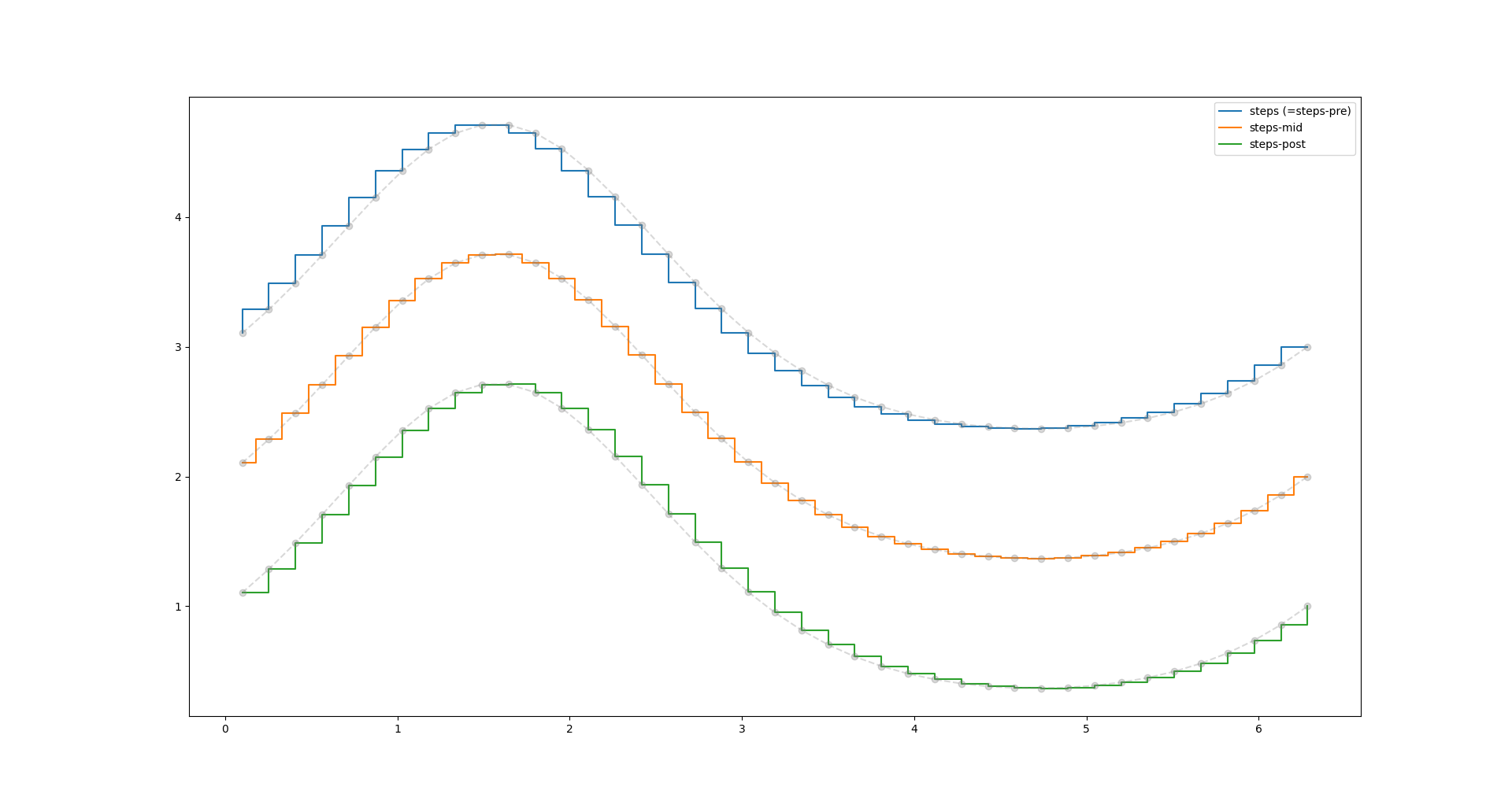
The drawstyle determines how the points are connected.
default: the points are connected with straight lines.steps-pre: The step is at the beginning of the line segment, i.e. the line will be at the y-value of point to the right.steps-mid: The step is halfway between the points.steps-post: The step is at the end of the line segment, i.e. the line will be at the y-value of the point to the left.steps: Equal tosteps-pre
plt.plot(x, y + 2, drawstyle='steps', label='steps (=steps-pre)')
plt.plot(x, y + 2, 'o--', color='grey', alpha=0.3)

plt.plot(x, y + 1, drawstyle='steps-mid', label='steps-mid')
plt.plot(x, y + 1, 'o--', color='grey', alpha=0.3)

plt.plot(x, y, drawstyle='steps-post', label='steps-post')
plt.plot(x, y, 'o--', color='grey', alpha=0.3)

plt.legend()
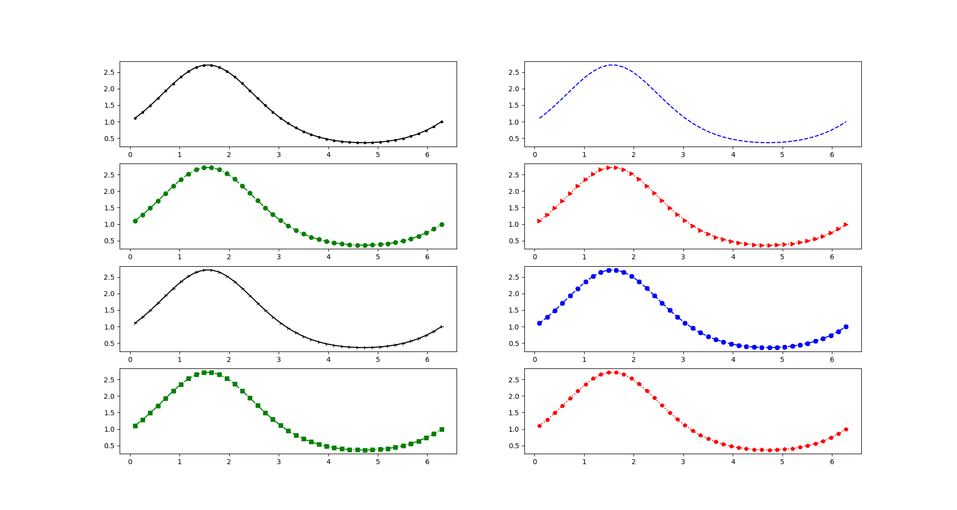
linestyle
-: solid line--: dashed line-.: dash-dot line:: dotted line
fig, axes = plt.subplots(4, 2)
x = np.linspace(0.1, 2 * np.pi, 41)
y = np.exp(np.sin(x))
axes[0,0].plot(x, y, 'k-')
axes[0,1].plot(x, y, 'b--')
axes[1,0].plot(x, y, 'g-.')
axes[1,1].plot(x, y, 'r:')
marker
.: point,: pixelo: circlev: triangle_down^: triangle_up<: triangle_left>: triangle_right1: tri_down2: tri_up3: tri_left4: tri_right8: octagons: squarep: pentagonP: plus (filled)*: starh: hexagon1H: hexagon2+: plusx: xX: x (filled)D: diamond|: vline_: hline
fig, axes = plt.subplots(4, 2)
x = np.linspace(0.1, 2 * np.pi, 41)
y = np.exp(np.sin(x))
axes[0,0].plot(x, y, 'k-', marker = '.')
axes[0,1].plot(x, y, 'b--',marker = ',')
axes[1,0].plot(x, y, 'g-.o')
axes[1,1].plot(x, y, 'r:>')
axes[2,0].plot(x, y, 'k-4')
axes[2,1].plot(x, y, 'b--8')
axes[3,0].plot(x, y, 'g-.s')
axes[3,1].plot(x, y, 'r:p')
format string
A format string consists of a part for color, marker and line:
fmt = '[marker][line][color]'
It should be used after the data pairs:
plot.plot(x1, y1, fmt1, x2, y2, fmt2)
Ticks & Labels & Legends
Repeat the above example and add more decarations.
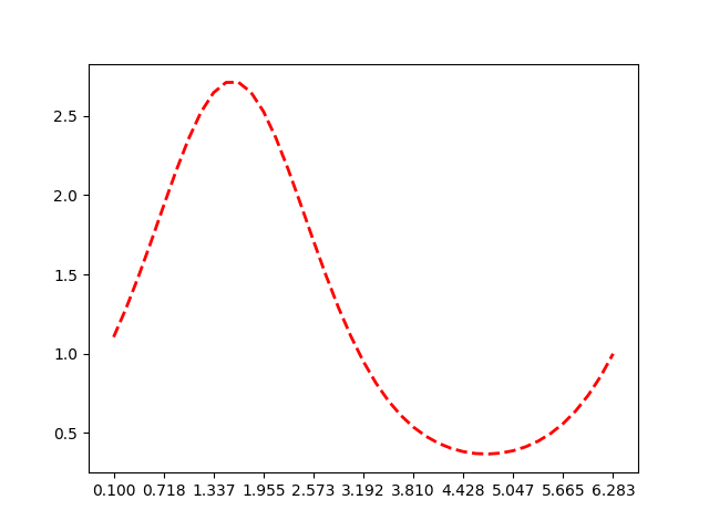
set x ticks
fig = plt.figure()
ax = fig.add_subplot(1,1,1)
ax.set_xticks(x[::4])
ax.plot(x, y, 'r--', lw = 2)
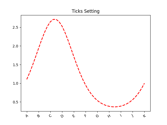
set labels to x ticks
fig = plt.figure()
ax = fig.add_subplot(1,1,1)
ax.set_xticks(x[::4], ['A','B','C','D','E','F','G','H','I','J','K'], rotation=30)
ax.plot(x, y, 'r--', lw = 2)
ax.set_title('Ticks Setting')
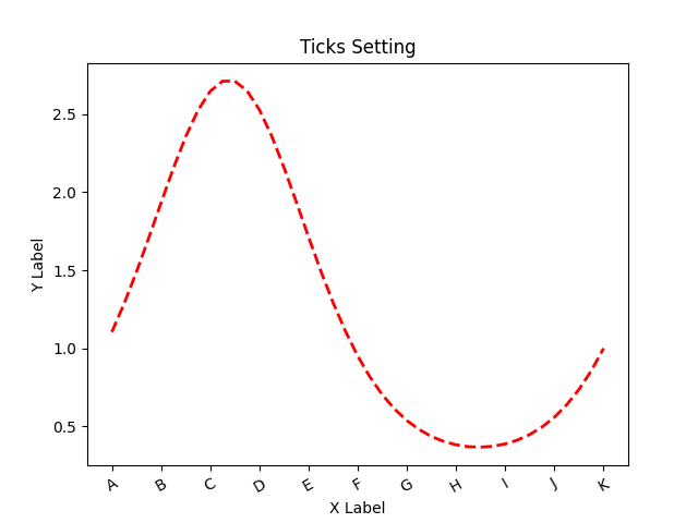
set labels to axis
ax.set_xlabel('X Label')
ax.set_ylabel('Y Label')
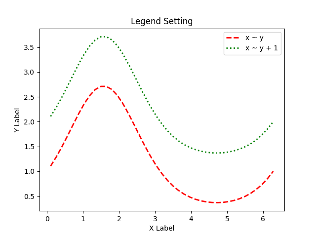
set legends
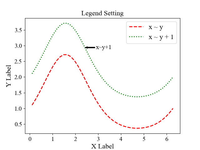
fig = plt.figure()
ax = fig.add_subplot(1,1,1)
ax.plot(x, y, 'r--', x, y + 1, 'g:', lw = 2)
ax.set_title('Legend Setting')
ax.set_xlabel('X Label')
ax.set_ylabel('Y Label')
ax.legend(['x ~ y', 'x ~ y + 1'])
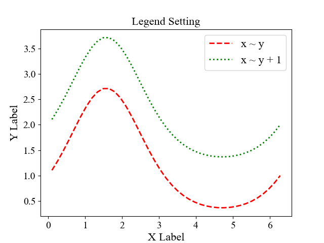
set fonts
from matplotlib.font_manager import FontProperties

font = FontProperties()
font.set_family('serif')
font.set_name('Times New Roman')
font.set_size(16)

fig = plt.figure()
ax = fig.add_subplot(1,1,1)

# ticks font
labels = ax.get_xticklabels() + ax.get_yticklabels()
for label in labels:
    label.set_fontname('Times New Roman')
    label.set_fontsize(14)

ax.plot(x, y, 'r--', label = 'x ~ y', lw = 2)
ax.plot(x, y + 1, 'g:', label = 'x ~ y + 1', lw = 2)

ax.set_title('Legend Setting', font = font)
ax.set_xlabel('X Label', font = font)
ax.set_ylabel('Y Label', font = font)
ax.legend(prop = font)
Annotations
We can add annotations and text using the text, arrow, and annotate functions.
ax.text()
Axes.text(x, y, s, fontdict=None, **kwargs)
Add the text s to the Axes at location x, y in data coordinates.
ax.text(x[15]+0.1,y[15]+1.1,'x~y+1',font='Times New Roman',fontsize=14)
ax.text(x[25]+0.1,y[25]+0.1,'x~y',font='Times New Roman',fontsize=14)

ax.arrow()
Axes.arrow(x, y, dx, dy, **kwargs)
This draws an arrow from (x, y) to (x+dx, y+dy).
ax.annotate()
Axes.annotate(text, xy, *args, **kwargs)
In the simplest form, the text is placed at xy.
Optionally, the text can be displayed in another position xytext. An arrow pointing from the text to the annotated point xy can then be added by defining arrowprops.
The specific parameters can be referenced to matplotlib.axes.Axes.annotate and matplotlib.text.Annotation.
ax.annotate(text = 'x~y+1', xy = (x[15], y[15]+1), xytext = (25, 0),
            xycoords = 'data', textcoords = 'offset points',
            arrowprops=dict(facecolor='black', headwidth=4, width=2, headlength=6),
            horizontalalignment='left', verticalalignment='center',
            font='Times New Roman',fontsize=14)
Drawing Shapes
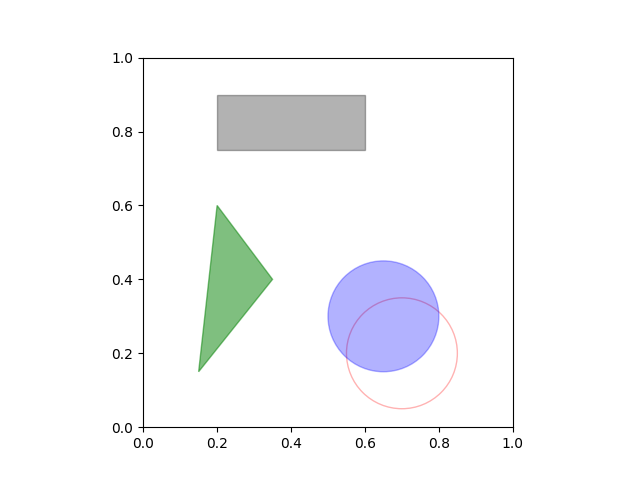
matplotlib has objects that represent many common shapes, referred to as patches. the full set is located in matplotlib.patches.
import matplotlib.patches as pch

fig = plt.figure()
ax = fig.add_subplot(1,1,1)

ax.set_xlim(0,1)
ax.set_ylim(0,1)
ax.set_aspect('equal', 'box')

rect = plt.Rectangle((0.2, 0.75), 0.4, 0.15, color='k', alpha=0.3)
circ1 = plt.Circle((0.7, 0.2), 0.15, color='r', alpha=0.3, fill=False)
circ2 = plt.Circle((0.65, 0.3), 0.15, color='b', alpha=0.3, fill=True)
pgon = plt.Polygon([[0.15, 0.15], [0.35, 0.4], [0.2, 0.6]], color='g', alpha=0.5)

ax.add_patch(rect)
ax.add_patch(circ1)
ax.add_patch(circ2)
ax.add_patch(pgon)
Save Figures
matplotlib.pyplot.savefig(*args, **kwargs)
savefig(fname, *, dpi='figure', format=None, metadata=None,
        bbox_inches=None, pad_inches=0.1,
        facecolor='auto', edgecolor='auto',
        backend=None, **kwargs
       )
Parameters:
fname: str or path-like or binary file-likedpi: float or ‘figure’, default:rcParams["savefig.dpi"](default:figure)format: str, e.g.,png,pdf,svg,eps- metadatadict, optional
bbox_inches: str or Bbox, default:rcParams["savefig.bbox"](default: None)- Bounding box in inches: only the given portion of the figure is saved. If ‘tight’, try to figure out the tight bbox of the figure.
pad_inches: float, default:rcParams["savefig.pad_inches"](default: 0.1)- Amount of padding around the figure when bbox_inches is ‘tight’.
facecolor: color or ‘auto’, default:rcParams["savefig.facecolor"](default:auto)- The facecolor of the figure. If ‘auto’, use the current figure facecolor.
edgecolor: color or ‘auto’, default:rcParams["savefig.edgecolor"](default:auto)- The edgecolor of the figure. If ‘auto’, use the current figure edgecolor.
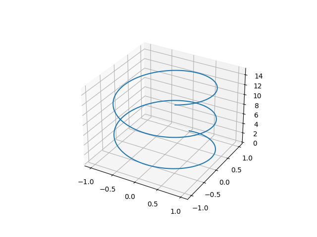
3D Plots
matplotlib supports 3D plots, we only need to import mpl_toolkits.mplot3d into the workspace and then create a three-dimensional axes by passing the keyword projection='3d' to any of the normal axes creation routines. Here is a list of the functions.
from mpl_toolkits import mplot3d
import numpy as np
import matplotlib.pyplot as plt

fig = plt.figure()
ax = plt.axes(projection='3d')

zline = np.linspace(0, 15, 1000)
xline = np.sin(zline)
yline = np.cos(zline)
ax.plot3D(xline, yline, zline, 'gray')
Comments