
Data Visualization [02]: Pandas and Seaborn Basics
Published:
matplotlib is a fairly low-level tool. pandas itself has built-in methods that simplify creating visualizations from DataFrame and Series objects. And seaborn further simplify the procedures. Unfortuantely, seaborn doesn’t have built-in support for 3D functionalities. However, we can still use seaborn style for 3D matplotlib plots. Let’s learn the basics of pandas and seaborn through some simple examples.
Flight Dataset
The dataset used will be the flight dataset, which has 10 years of monthly airline passenger data.
import seaborn as sn
import numpy as np
import pandas as pd
import matplotlib.pyplot as plt

sn.set(style='darkgrid')

data = pd.read_csv('flight.csv', sep=',')

data
Out[95]:
     year      month  passengers
0    1949    January         112
1    1949   February         118
2    1949      March         132
3    1949      April         129
4    1949        May         121
..    ...        ...         ...
139  1960     August         606
140  1960  September         508
141  1960    October         461
142  1960   November         390
143  1960   December         432

[144 rows x 3 columns]

# check the detailed info of the dataset
data.info()
<class 'pandas.core.frame.DataFrame'>
RangeIndex: 144 entries, 0 to 143
Data columns (total 3 columns):
 #   Column      Non-Null Count  Dtype
---  ------      --------------  -----
 0   year        144 non-null    int64
 1   month       144 non-null    object
 2   passengers  144 non-null    int64
dtypes: int64(2), object(1)
memory usage: 3.5+ KB
pandas.DataFrame.plot()
In pandas, the plot method on Series and DataFrame is just a simple wrapper around plt.plot(), with some additional parameters.
DataFrame.plot(*args, **kwargs)
Here is a list of the parameters, where the kind can be used to indicate the type of the plot:
xykindline: line plot (default)bar: vertical bar plotbarh: horizontal bar plothist: histogrambox: boxplotkde: Kernel Density Estimation plotdensity: same askdearea: area plotpie: pie plotscatter: scatter plot (DataFrame only)hexbin: hexbin plot (DataFrame only)
axsubplotsharexshareylayoutfigsizeuse_inextitlegridlegendstylelogxlogyloglogxticksyticksxlimylimxlabelylabelrotfontsizecolormapcolorbarpositiontableyerrxerrstackedsort_columnssecondary_ymark_rightinclude_bool- `backed’
Now, let’s consider plotting a line graph of columns ‘year’ and ‘passengers’ using DataFrame.plot(), which will create something like this:
plt.figure()
data.plot(x = 'year', y = 'passengers')
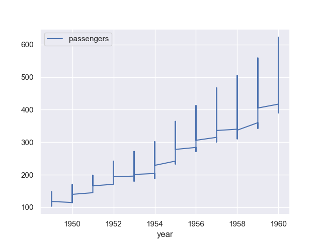
The graph looks kind of weired. We will improve it using seaborn below. Let’s now draw the line graph in groups grouped by month.
Firstly, we need to convert it to a pivot table:
data_wide = data.pivot("year", "month", "passengers")

data_wide
Out[102]:
month  April  August  December  February  ...  May  November  October  September
year                                      ...
1949     129     148       118       118  ...  121       104      119        136
1950     135     170       140       126  ...  125       114      133        158
1951     163     199       166       150  ...  172       146      162        184
1952     181     242       194       180  ...  183       172      191        209
1953     235     272       201       196  ...  229       180      211        237
1954     227     293       229       188  ...  234       203      229        259
1955     269     347       278       233  ...  270       237      274        312
1956     313     405       306       277  ...  318       271      306        355
1957     348     467       336       301  ...  355       305      347        404
1958     348     505       337       318  ...  363       310      359        404
1959     396     559       405       342  ...  420       362      407        463
1960     461     606       432       391  ...  472       390      461        508

[12 rows x 12 columns]
Now we can plot the graph simply by data_wide.plot(), which creates the graph below.
seaborn.lineplot()
Let’s consider improving the line graph using seaborn.lineplot().
By default, seaborn.lineplot() will plot mean and 95% confidence levels, making it look much better:
plt.figure()
sn.lineplot(x = 'year', y = 'passengers', data=data)
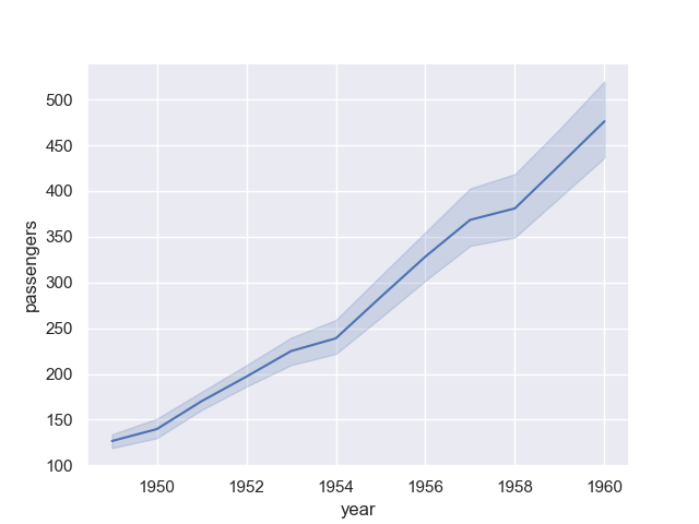
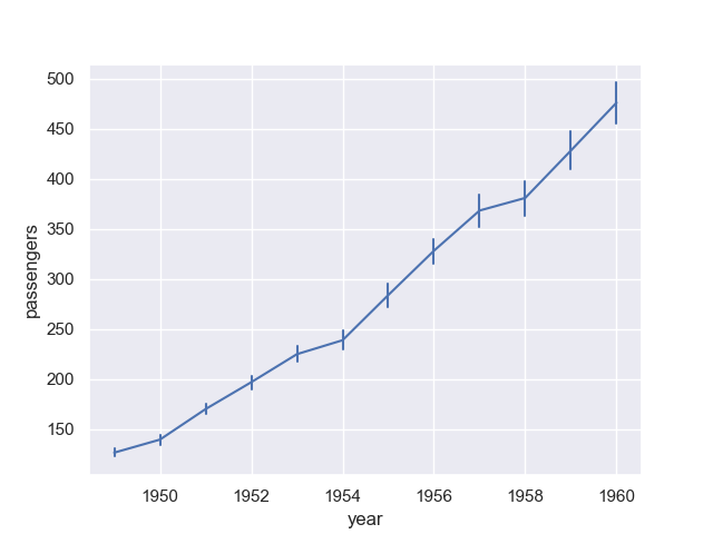
The confidence interval is displayed in translucent error bands by default and with 95% confidence level. We can also change the error style to ‘bars’ by parameter err_style and confidence level by parameter ci:
plt.figure()
sn.lineplot(x = 'year', y = 'passengers', data = data,
            err_style = 'bars', ci = 95)
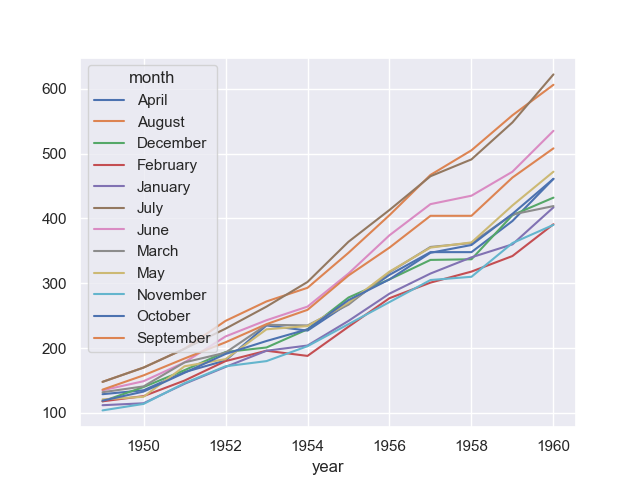
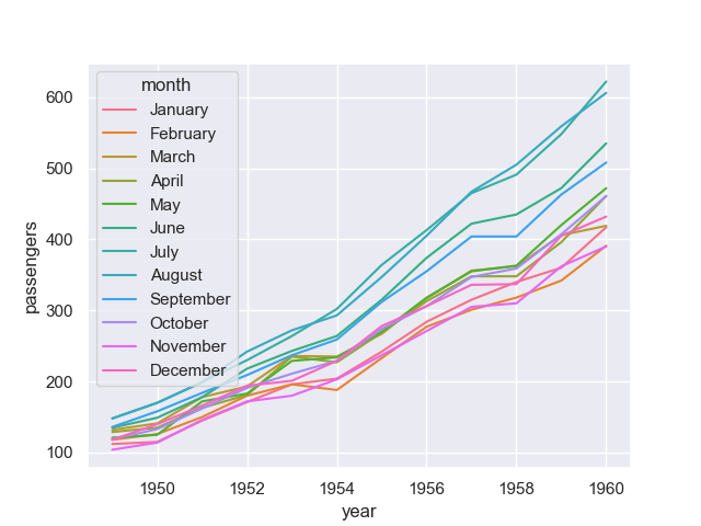
To group the data, we can use parameter hue, size or style (which is very convenient):
plt.figure()
sn.lineplot(x = 'year', y = 'passengers', hue = 'month', data = data)
To distinguish the groups, besides different line styles, we can also use markers for different groups using markers:
plt.figure()
sn.lineplot(x = 'year', y = 'passengers', hue = 'month', data = data,
            style = 'month', markers=True)
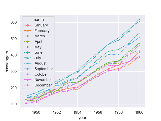
Now, the line graph looks much better.
Reference to DataFrame.plot() and seaborn.lineplot()
Others Plots: Overview
pandas
- In addition to the
kindparameter inDataFrame.plot(), there are theDataFrame.hist()andDataFrame.boxplot()methods, which use a separate interface. - We can also use the methods
DataFrame.plot.<kind>, including:DataFrame.plot.areaDataFrame.plot.barhDataFrame.plot.densityDataFrame.plot.histDataFrame.plot.lineDataFrame.plot.scatterDataFrame.plot.barDataFrame.plot.boxDataFrame.plot.hexbinDataFrame.plot.kdeDataFrame.plot.pie
- There are also several plotting functions in
pandas.plottingthat take a Series or DataFrame as an argument, including:andrews_curvesautocorrelation_plotbootstrap_plotboxplotlag_plotparallel_coordinatesradvizscatter_matrix
seaborn
- Relational plots
replot: Figure-level interface for drawing relational plots onto a FacetGrid.scatterplotlineplot
- Distribution plots
displot: Figure-level interface for drawing distribution plots onto a FacetGrid.histplotkdeplot: Plot univariate or bivariate distributions using kernel density estimation.ecdfplot: Plot empirical cumulative distribution functions.rugplot: Plot marginal distributions by drawing ticks along the x and y axes.
- Categorical plots
catplot: Figure-level interface for drawing categorical plots onto a FacetGrid.stripplot: Draw a scatterplot where one variable is categorical.swarmplot: Draw a categorical scatterplot with non-overlapping points.boxplot: Draw a box plot to show distributions with respect to categories.violinplot: Draw a combination of boxplot and kernel density estimate.boxenplot: Draw an enhanced box plot for larger datasets.pointplot: Show point estimates and confidence intervals using scatter plot glyphs.barplot: Show point estimates and confidence intervals as rectangular bars.countplot: Show the counts of observations in each categorical bin using bars.
- Regression plots
lmplot: Plot data and regression model fits across a FacetGrid.regplotresidplot
- Matrix plots
heatmapclustermap
- Multiplot grids
FacetGrid: Multi-plot grid for plotting conditional relationships.pairplot: Plot pairwise relationships in a dataset.PairGrid: Subplot grid for plotting pairwise relationships in a dataset.joinplot: Draw a plot of two variables with bivariate and univariate graphs.JointGrid: Grid for drawing a bivariate plot with marginal univariate plots.
An overview of seaborn can be referenced to this page. We will delve deeper into these plots in the future plots.
Comments